
Why Keslev Is Not a Brown Hearth Aesthetic
Why Keslev Is Not a Brown Hearth Aesthetic
Keslev interiors can include warmth, wood, clay, and hearth elements, but their real identity is orchard abundance: visible food, living color, useful storage, family learning, and clean-return systems.
The Problem: “Hearth” Can Shrink the Design Too Quickly
When people hear the word hearth, they often imagine brown wood, stone fireplaces, dark cooking rooms, rustic kitchens, and heavy earth tones. Those references can be useful in small amounts, but they can also flatten Keslev into one narrow look.
That is the problem: a food-centered interior can easily become a brown rustic room even when the deeper idea is much richer. Keslev is not only about heat. It is about food entering the home, being stored clearly, prepared safely, shared with the family, returned cleanly, and connected back to the orchard.
What Keslev Actually Needs to Express
Keslev interiors need to express food abundance in a practical way. That means the room should show food, support storage, help children learn, make cleaning easier, and connect the household to gardens, orchards, pantries, and clean-return systems.
The Correct Keslev Color Logic
Keslev should not be colorless, and it should not be trapped in brown. Its palette should behave like an orchard food room: clean enough for family use, colorful enough to show abundance, and grounded enough to handle real work.
Shell-Ivory
Breathing space, clean walls, wash zones, ceiling planes.
Orchard Green
Main life color for cabinets, panels, storage bodies.
Dark Orchard Green
Depth for seating, insets, pod interiors, mature garden contrast.
Apple Red
Punctuation for pantry bodies, fruit drawers, special storage zones.
Pomegranate
Rare accent for ceremonial storage, medallions, or special harvest areas.
Honey Gold
Glow, trim, route lines, shelf lighting, hospitality warmth.
Dark Practical Stone
Washable floors for real cooking, rinsing, movement, and cleanup.
What Brown Can Do — and What It Must Not Do
Brown is not banned. Wood, bark, clay, dark stone, and warm earth tones can support Keslev. The rule is that they must serve the room’s food intelligence instead of replacing it.
Wrong use of brown
- Turning every surface into dark wood.
- Making the kitchen feel like a rustic lodge.
- Using brown because the word “hearth” appeared.
- Hiding food systems behind generic cabinetry.
- Creating a dark cave feeling that weakens family use.
Right use of brown
- Dark washable flooring that can handle real work.
- Restrained carved wood for handles, edges, and structural warmth.
- Bark-like or breadfruit textures on specific furniture bodies.
- Clay or mineral surfaces near washing and cooking zones.
- Earth tones used under orchard green, apple red, and honey gold.
How the Correct Keslev Interior Works in Real Life
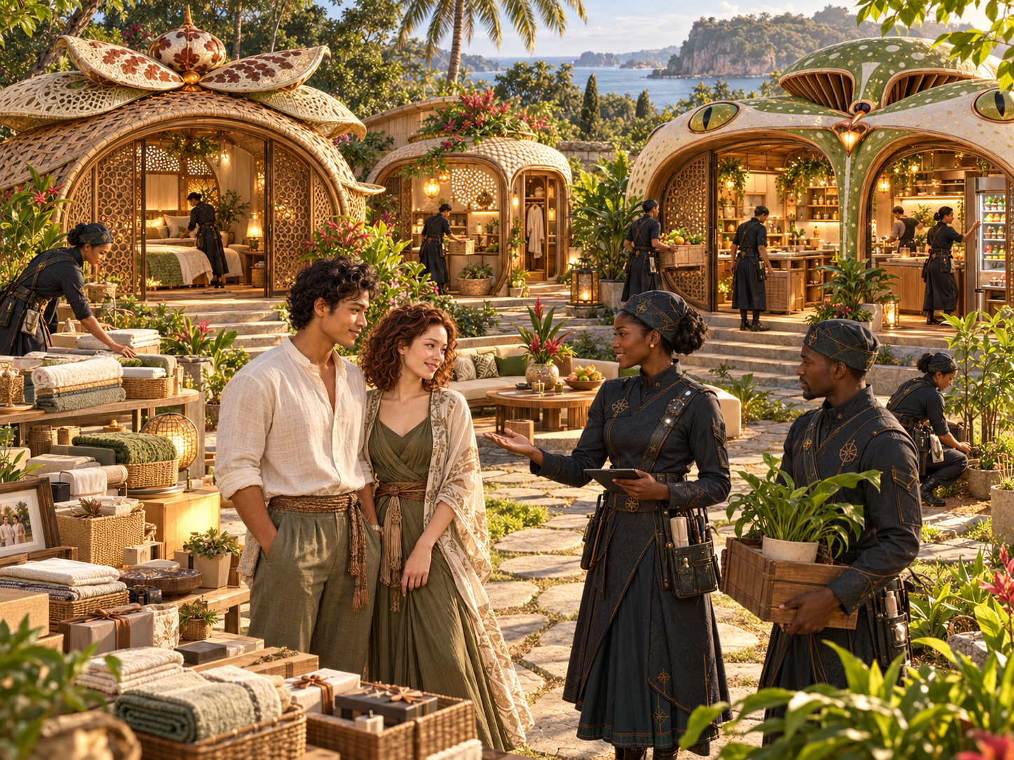
Imagine a family receiving a food delivery from a Keslev Sabennerie. A Sabennerie is a Trott Bailey food-support center that prepares or distributes food in a family-supportive way. The food arrives wrapped in banana leaves, not plastic takeout packaging. The kitchen and pantry must be ready to receive it.
- The food arrives at a receiving ledge. The ledge is near the kitchen spine, not far away from where the food will be sorted, eaten, stored, or returned.
- Packages are sorted by use. Some bundles go to the dining table, some to the pantry, some to the child tasting ledge, and some to cold or dry storage.
- The room uses color to guide behavior. Orchard-green cabinets hold daily food. Apple-red drawers may mark fruit or child snack zones. Honey-lit shelves show jars and baskets clearly.
- Wet items go to dry-return. Cloths, baskets, rinsed tools, and containers are placed in a Dry-Return Wall so they dry safely before storage.
- Krubaro handles return. Krubaro is the clean-return system. It gives scraps, water, jars, baskets, and packaging a clean path back to compost, reuse, filtering, or storage.
- The room stays understandable. A parent can see what is available, a child can help without confusion, and a steward can deliver into a room that knows how to receive.
Why the Fruit-Pod Pantry Proves the Point
The strongest Keslev interior example is the Fruit-Pod Pantry or Abundance Store Room. It proves that Keslev does not need to look like a brown hearth room to feel warm, practical, and food-centered.
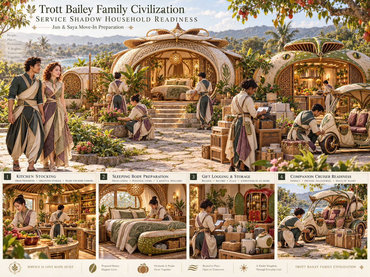
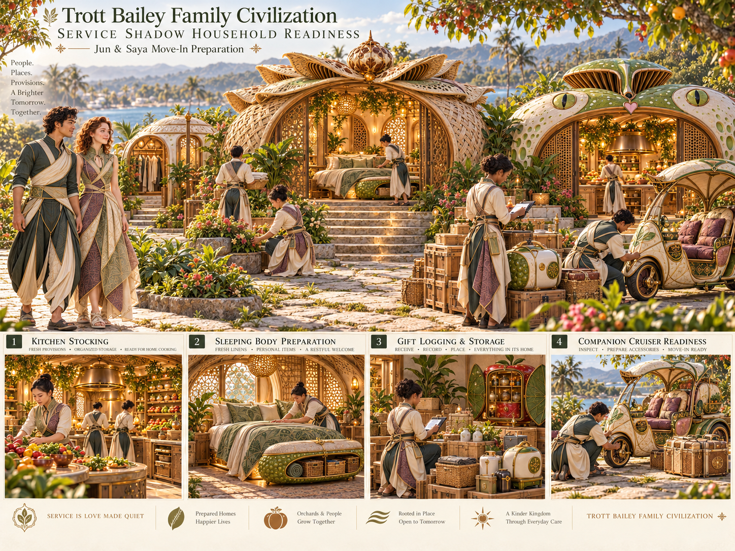
A Fruit-Pod Pantry can use shell-ivory walls, orchard-green storage pods, apple-red pantry bodies, honey-lit shelves, pomegranate accents, and dark practical flooring. The warmth comes from usefulness, visibility, and family support — not from covering the room in brown.
Why This Matters for the Trott Bailey Family Kingdom
The Trott Bailey Family Kingdom is being designed as a family-first civilization. That means interiors must not only impress people. They must support daily life. A food room should reduce confusion, protect children, honor food labor, and prevent useful materials from becoming waste.
If Keslev is reduced to brown hearth styling, the design loses its larger purpose. It stops showing the orchard, the pantry, the child learning system, the delivery culture, the clean-return loop, and the family support logic.
Design Rules Going Forward
- Do not default to brown because the room has a hearth.
- Use shell-ivory to keep the room clear, clean, and breathable.
- Use orchard green as the main life color.
- Use apple red and pomegranate as controlled food-memory accents.
- Use honey gold for glow, trim, handles, and route lines.
- Use dark washable floors because real food work requires practical surfaces.
- Use wood, bark, and clay with restraint.
- Make storage visible, child-learnable, and beautiful.
- Include Krubaro return systems as clean infrastructure, not hidden trash.
Practical Summary
Keslev is not a brown hearth aesthetic. Keslev is the interior language of food sovereignty, orchard abundance, visible storage, family nourishment, child learning, and clean return.
A hearth can belong in Keslev as the cooking heart of the room. Brown materials can belong as grounding layers. But the full Keslev identity must include orchard green, shell-ivory, apple red, honey gold, pomegranate accents, dark practical floors, fruit-body furniture, and Krubaro return logic.
The rule is clear: hearth is a function; orchard abundance is the identity.



 and then